promotional photography

Lomography Colour 100 medium format review

 
0-7.jpg

Here we are with part two of a three part series featuring films from a recent portrait shoot with Monika! If you haven’t already, check out part 1 HERE but if you’re not bothered about that then read on and welcome to this review which is focussing on yet another new to me film stock - Lomography Colour 100, which I shot in medium format 120 flavour on the mighty Pentax 67!

0-8.jpg

I’ve shot a few rolls of different Lomo films over the years (and predictably enough blogged about them too) colour 400 in 35mm HERE and Colour 800 in 120 HERE. So what’s this Lomo colour 100 like then?! I hear you cry! Well first of all just look for yourselves - I think it looks great!

0-4.jpg

As you can see this was a sunlit location shoot with the very talented Monika. This presented the Lomo film with an opportunity to shine! In good light it’s a clearly very fine grain film, with strong contrast and rich colour balance - it’s punchy which I like and gives plenty of fine detail too. The 120 format certainly helps in that resolving power, as does the Super Multi Coated Takumar 105mm 2.4 lens on the P67 on which it was shot.

0-2.jpg

I think it has a slightly different look and feel to portra films which can be a little more muted and if I’m honest a little more to my taste. Don’t get me wrong though Lomo colour is a lovely film stock - I haven’t tried it out in poor/mixed lighting yet so I can’t speak to it’s flexibility but if it bears anything in common with the Lomo 800 film I imagine it will hold highlights well but lose the shadows fairly quickly in poor lighting. So it’s all sweetness and light then is it? Not exactly…

0-10.jpg

I would be remiss dear reader if I didn’t share the shortcomings of this film stock, in fact I think it’s worth saying up front that I have a bit of an issue with Lomo films in general - I don’t know whether it’s how they’re packaged or what but they are VERY prone to light leaks and/or having half a frame burned away for no good reason, I can forgive this when shooting 35mm because with 36 exposures to play with I can spare the odd one or two but when it comes to 120 film and something like the Pentax 67 which only gives me 10 frames per roll if one or two frames are frazzled then that’s a big chunk out the roll - I’m 99% certain it’s not an issue with loading as it only ever seems to be Lomo films that I have this issue with…. what the heck LOMO?!?!

0-9.jpg

Anyway back to the good stuff, aside from issues with the occasional random light leak/burned frame I really like this film stock - I was going to say that it’s a good budget choice but actually prices seem to be on the rise across the board and prices for a three pack of this film are £22 and upwards which is bonkers really - honestly I’m definitely starting to feel the ‘burn’ pardon the pun with film prices and after this shoot where I shot only colour film stocks I think my next few will be black and white only affairs and develop at home!

0-3.jpg

So that’s it for this review! I hope you’ve enjoyed the images and my ramblings about Lomo 100 and if you didn’t well - tough! :) Stay tuned for the final thrilling instalment in this trilogy of colour film stock reviews when i’ll be sharing my thoughts on yet another (yes another) new to me film stock!
Film Photography Workshops - Start your Adventure on Film!

I am delighted to announce the launch of my in person film photography workshops! Whether you’re a newcomer to the world of film photography or an experienced shooter looking for a new creative challenge - my film photography workshops are built around your specific requirements.

IMG_9673.jpg
 
IMG_9252.jpg

I can tailor a workshop to suit your requirements, examples of topics covered include:

  • The fundamental principles of photography

  • Metering and working with light

  • Create stunning portraits using natural and artificial light

  • Choosing the right film for the right occasion

  • Developing and scanning your negatives

  • Printing your negatives in the darkroom

Sign up to recieve updates about my in person and online workshops and get access to your free ‘Adventures on Film’ guide to film photography which is packed with my top tips for shooting with film and making every frame count!

Lomography Lomochrome Purple Review

 
0-9.jpg

Hello friends!! It’s been a little while since I did an out and out film review but fear not!! Today I shall make amends for this by giving the first of THREE (that’s right THREE) film reviews - gosh aren’t you lucky (don’t answer that)! These were all brand new films to me that I hadn’t used before each with their own unique look, so while they may have been shot on the same shoot they definitely have their own story to tell. First up we’ll begin with some purple otherwordly strangeness in the form of Lomography Lomochrome Purple XR 100-400 (my goodness what a mouthful)!!

IMG_1197(1).JPG

I’ve had a couple of rolls on ice for some time and so with Lockdown restrictions easing here in the UK making photoshoots ‘a thing’ again I defrosted one roll and loaded it up into my Nikon L35AF point and shoot which accompanied me on a shoot with the very talented Monika - check her out on IG for more evidence of her awesomeness!!

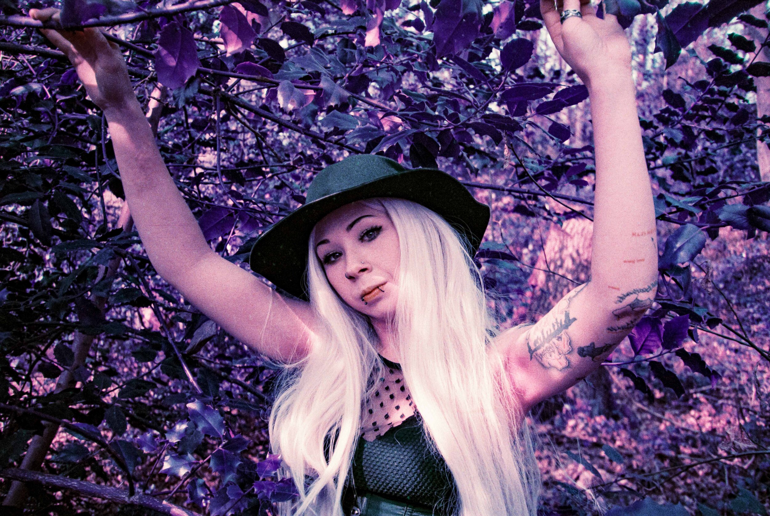
As you can see Lomochrome Purple does exactly what it says on the tin - Blue becomes green, green becomes purple, yellow becomes pink! It’s an effect that is possibly as near to shooting old school aerochrome colour infrared that us mere mortals will get these days (proper colour IR film is STUPID expensive) what I love about the film is it can introduce an entirely new angle on a shoot - alongside the Lomochrome I shot some ‘normal colour’ film stocks but it was great to have this additional creative film along for the ride.

0-5.jpg

According to the box this film can be shot anywhere between 100 and 400, but looking around online I think it’s best to stick to the 100 side of things as this will give you the most pronounced purple colour shifts, of course your mileage may vary but this film isn’t cheap and I very definitely erred on the side of caution with my metering!

0-11.jpg

These were taken on a very bright sunlit day - in fact I had a reflector with me that I didn’t use and I wish that I had for one or two of these a: to balance the hard shadows and b: to give the film some extra light to work with - as you can see this film does not record shadow detail very well and the drop off is quite pronounced, that being said but I do kind of like the effect in the background elements as it gives you quite a punchy, contrasty look but I thinkI’d have liked to have kept some more detail around Monika as my subject!

0-13.jpg

The grain structure is visible and I quite like it. The film resolves quite a lot of detail especially in the highlights and where it does fall off the grain has a gritty feel - this is most definitely not a smooth film so be prepared to embrace the grain! What I did notice in the film scans and I confirmed this with Exposure Film Lab who developed the film for me was quite a few thin lines across the image possibly from dye running off through the development, it was easy to remove in lightroom but certainly expect to do a bit of post processing removing weird artefacts in Photoshop or Lightroom (I felt like a digital shooter for a minute)! UURGH!

0-35.jpg

I picked the above image out as it shows a few things worth taking note of:

1: This was probably the most extreme example of the lines that were apparent on more than a few frames

2: My sadness at the big bloody STUPID line spoiling the shot was lessened because clearly the little Nikon L35AF wasn’t feeling the strong backlighting here (even though it has a little lever to compensate for back lighting) clearly there are limits to what you can expect - and in this situation you can expect to see a big increase in grain and lack of contrast

3: Which moves onto point number three - The lomo purple clearly didn’t enjoy this lighting either - you can see the purple shifting to a more muddy, muted, brownish colour, and the grain structure kind of falls apart a bit too and loses contrast - meh!

0-8.jpg

I tried my best to make the most of the greenery around, at the time of the shoot most of the trees were still bare but there was enough evergreen ivy around for us to work with and Monika did a great job of diving into the spiky Ivy branches! Skin tones were very much on the pinky/red side of things despite Lomographys assertions that this film keeps skin tones looking natural but to be honest my advice is to just embrace the colour shifts and go with it, I really love how these shots came out - Lomochrom Purple is a great way to add an instant creative edge to a shoot and works well when shot alongside some more traditional colour/black and white stocks.

0-14.jpg

So in conclusion then what can we say about Lomography Lomochrome XR 100-400 (aside from the ridic long name) well my completely subjective and unscientific analysis is: I absolutely love it! (‘What a fucking surprise’ I hear you cry)!! Fair comment - I am yet to meet a film stock that I didn’t fall in love with one way or the other…. although with this one I was especially uncertain with it being such an unusual film to begin with and then first time shooting it.

One of the things that I enjoy about film photography is that many of your creative choices are made up front when it comes to choosing films stocks etc Lomo Purple gives you a really ‘out there’ trippy vibe right off the bat. It’s not a cheap film and based on my experience it really does need good lighting so while I have another roll on ice, I’ll be waiting for the right opporutnity to bring it out. I have to say that it was great shooting the little Nikon L35AF loaded up with this bonkers film - a great little camera that will have a blog of its own one day I promise!!

Would i use Lomo Purple as a stand alone film stock for a portrait shoot? No… I feel it’s more of a creative addition to your colour pallete rather than the main focus or at least that’s how I used it, which brings us nicely to a reminder to watch this space for parts 2 and 3 of this film review trilogy - I’ll be bringin you another Lomo film this time a more traditional stock Lomography colour 100 in medium format! I bet you can’t wait…. but you’ll have to, I haven’t written the damn thing yet…

Dark Future: A shoot on Kodak Portra at 1600

0-1.jpg

It’s almost November 2019 and that can mean only one thing: we are now living at the time that the original blade runner movie was set!! While there’s certainly no denying that at times it can feel like we’re already living in a dystopian Dark Future, as with all things the reality is often less stylistically pleasing than our celluloid fantasies would suggest – to rectify this, my latest shoot was a Dark Future/Neon Noir/Blade Runner inspired look with the very awesome Charlie Hex 

0-2.jpg

This shoot presented me with a number of new creative challenges – first and foremost amongst these was lighting. Having scouted out a suitable location (and a huge shout out at this point goes to The Arcade Club in Leeds for hosting us) I also wanted to have some control over the lighting too, but given that we were shooting in a public space and the fact that I also have two cameras to lug around I needed something fairly compact – enter the LED light pad! I then used a couple of sheets of cellophane to create my own lighting gels and voila! 

Ignore the F90X in this pic - I changed my mind at the last minute and went for the F2 instead :)

Ignore the F90X in this pic - I changed my mind at the last minute and went for the F2 instead :)

In the run up to this shoot I rewatched the original Bladerunner movie which has been a firm favourite of mine for as long as I can remember, I also re-watched the sequel Bladerunner 2049 (a film which I went to the cinema to watch when it came out and honestly thought it was a bit rubbish) what was interesting was to re-watch both movies but specifically to pay attention to the lighting and how it is used to enhance the narrative of the story – as it turned out I actually really enjoyed 2049 the second time around and one thing I took from the film as a major inspiration was the amazing colour palettes – in particular the strong use of orange lighting, obviously the creative lighting budget for both of these films far exceeds any resources I was able to throw at this project (my orange lighting gel is just two pieces of cellophane, one yellow and one red laid over each other) but as you can see here with a little thought and a cheap LED light, creative possibilities abound!

0-11-Edit.jpg

 A Dark Future inspired look has been on my wish list for a long time and I was delighted when Charlie got in touch after a casting I posted on FB. The images speak for themselves of course but it’s still worth stating that Charlie absolutely smashed it on this shoot!! I shared a few mood boards with Charlie and she came back with the makeup and outfit looks you can see in these images, this combined with her being super confident in front of camera really helped to realise the vision, a proper creative collaboration! Big thanks too to Charlie’s boyfriend Jony who did a sterling job as human light stand by holding the LED light for me :)

0-6.jpg

 During the shoot itself we were in the midst of a very busy Arcade location, mixed and changing lighting and I didn’t have chance to visit the space ahead of the shoot (something I had planned on doing) armed with my trusty light meter, Pentax 67 and Nikon F2 I felt confident I could handle things but as always with film you don’t know until you get the films developed how things really turned out.

0-19-Edit.jpg
Looks like my P67 still has a bit of an issue with the frame spacing with this accidental double exposure - fortunately in this case, I flipping love it!

Looks like my P67 still has a bit of an issue with the frame spacing with this accidental double exposure - fortunately in this case, I flipping love it!

 I was also using a brand new (to me) lens the amazing Nikkor H C 85mm 1.8 and wow has this lens blown me away!! It’s perfect for lowlight shooting – most of these images were shot around f2 or f2.8 and for the Pentax 67 I was mostly wide open at f2.4

The Nikon F2 and the amazing Nikkor H C 85mm 1.8

The Nikon F2 and the amazing Nikkor H C 85mm 1.8

As it’s turned out I think most of my fave shots are with the F2 and the 85mm lens, given the low light and relatively slow shutter speeds (all around 1/60) I am very pleased with how they came out.

Now let’s talk about film stocks -  I used Kodak Portra 400 for both 35mm and 120 formats and again, wow! I am blown away at how awesome it looks! I rated the film at 1600 and asked the lovely people at Exposure Film Lab who do all my colour developing to develop the film at 1600 (push it two stops) the results speak for themselves – colour balance is spot on and to my eye they just look RIGHT!

0-13-Edit.jpg

This is the beginning of a wider Dark Future project I’ll be exploring on future shoots mainly cos I’m a Sci Fi geek and have always loved that Neon Noir vibe ranging from Bladerunner to Akira and beyond - I Can’t wait to add some more retro futurist looks to my portfolio and to explore some more creative lighting techniques!

0-2.jpg
0-8.jpg
0-32.jpg

High Fashion in the High Peaks - Portrait Shoot with Chanel Joan Elkayam

Welcome to the latest in my series of creative collaborations which have the express purpose of helping me to grow my photography portfolio as well as grow connections, grow confidence and grow creatively - basically it’s all about growth!

0-4-Edit-Edit.jpg

On my travels through this universe I have had the pleasure of meeting some really cool, talented and interesting people - on very special occasions I sometimes have the opportunity to work with them and for that I am supremely grateful! My latest (and perhaps greatest) collaboration so far has been with the very wonderfully talented Chanel Joan Elkayam!

1DBAD21F-B29C-4207-827A-47FC93060FC2(1).JPG

The background to this shoot is that I met Chanel a few years ago when I was 2nd shooting for my friend Ruth, ever since then it has been wonderful to see how Chanel has grown into her amazing success as an Industry recognised Fashion Designer, Chanel is the youngest person to have showcased at all 4 of the major fashion shows London, Paris, New York and Milan and she achieved all of this by the age of 18 - basically she’s the real deal! As you can tell I am full of admiration for Chanel’s achievements and I can’t wait to see where her journey takes her next! you can see more of her work HERE.

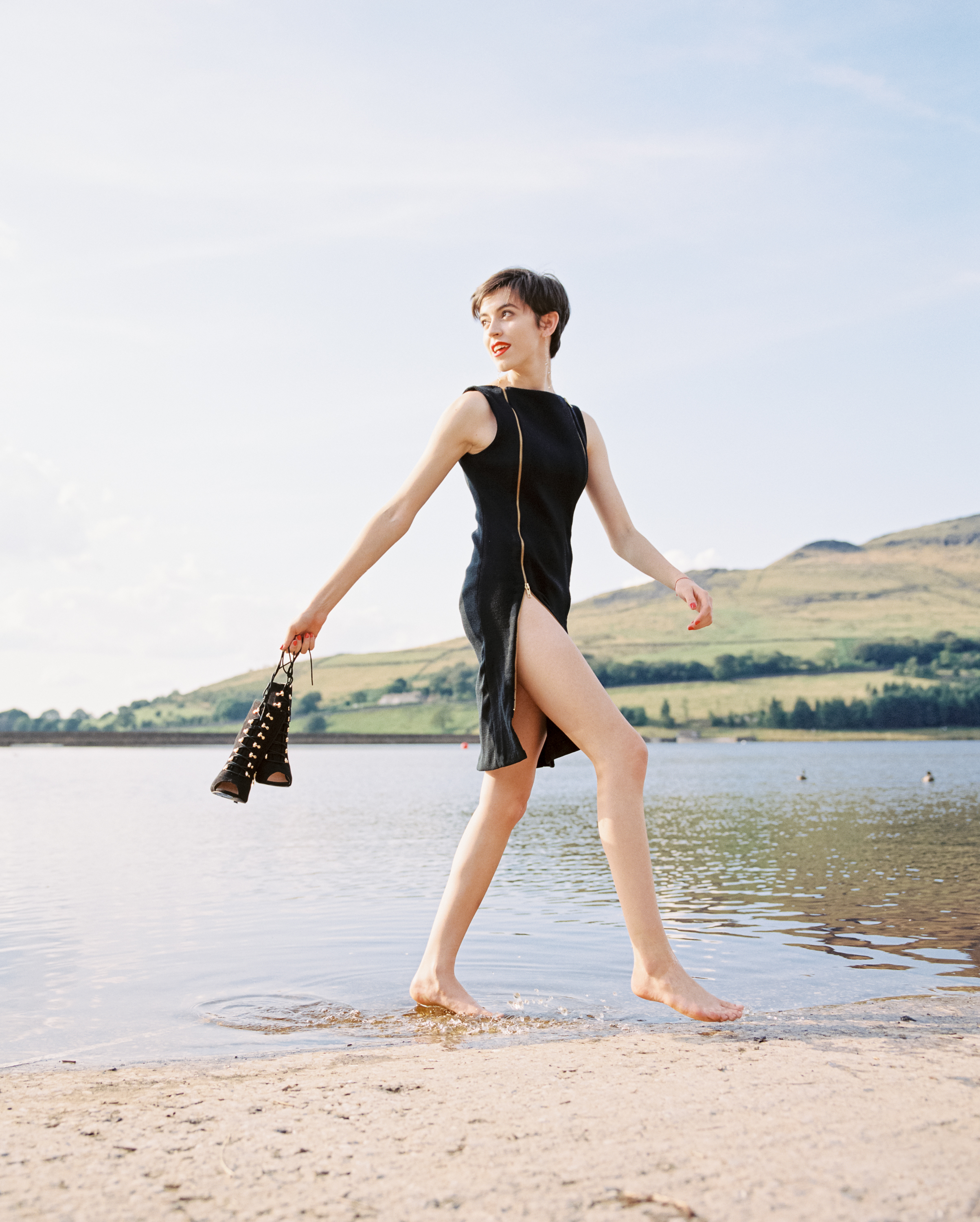
For this shoot we wanted to showcase some of Chanel’s fashion designs in a natural setting, we chose Dovestones as our location in part because it’s really local for us both and also because it’s amazingly beautiful too! The weather even behaved itself and gave us lots of lovely sunlight to play with too.

C0777458-F9B7-48CD-A752-CBC307C462EA.JPG

I relied on my now favourite combination of the Pentax 67 as primary camera and Nikon F2 as a second body - this set up gives me tip top quality lenses in both medium format and 35mm and I just really like working with them both. Filmwise it was again an all Kodak affair with Portra 400 loaded in the P67 and a couple of rolls of Portra 800 and a cheeky roll of Kodak Pro image 100 for the F2.

IMG_1203.jpg

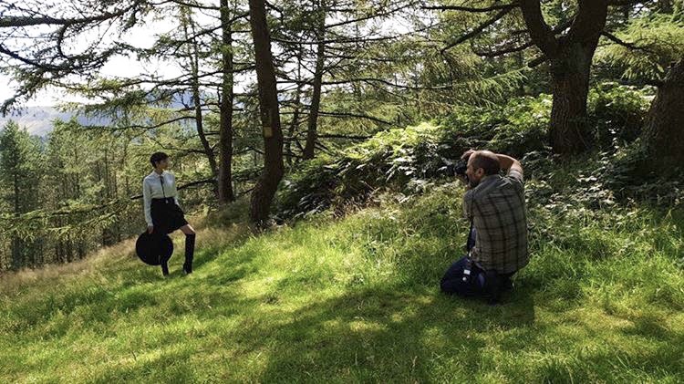
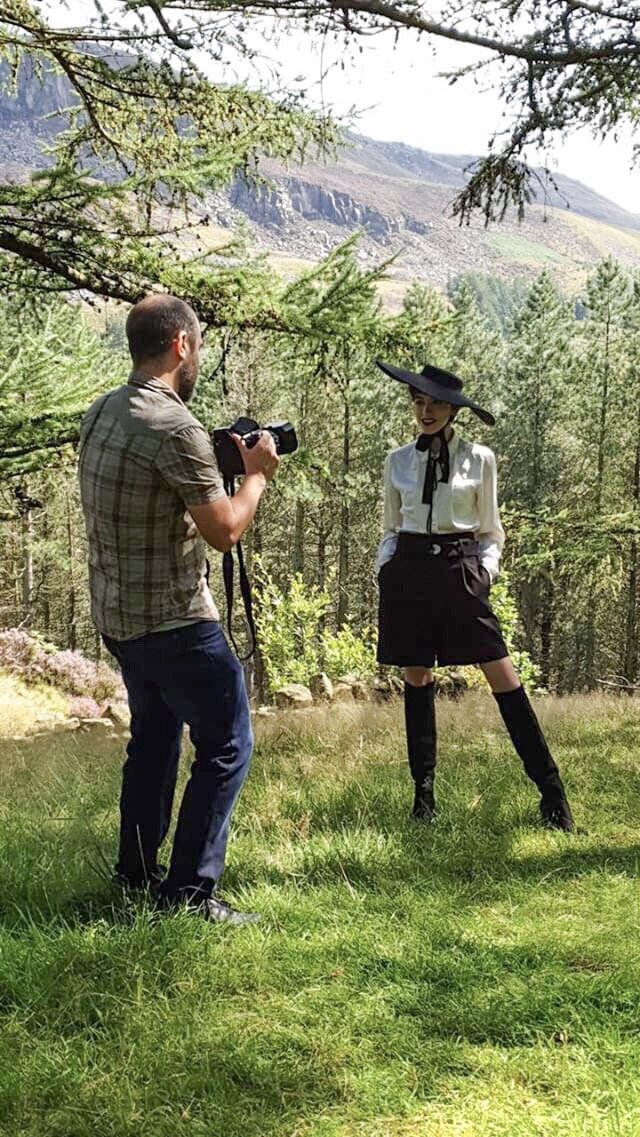
It was so much fun working with Chanel on this shoot, and also a huge thank you to Chanel’s mum too who joined us - it was really lovely to meet her and a big thank you for taking the behind the scenes photos you can see at the start of this blog too! :)

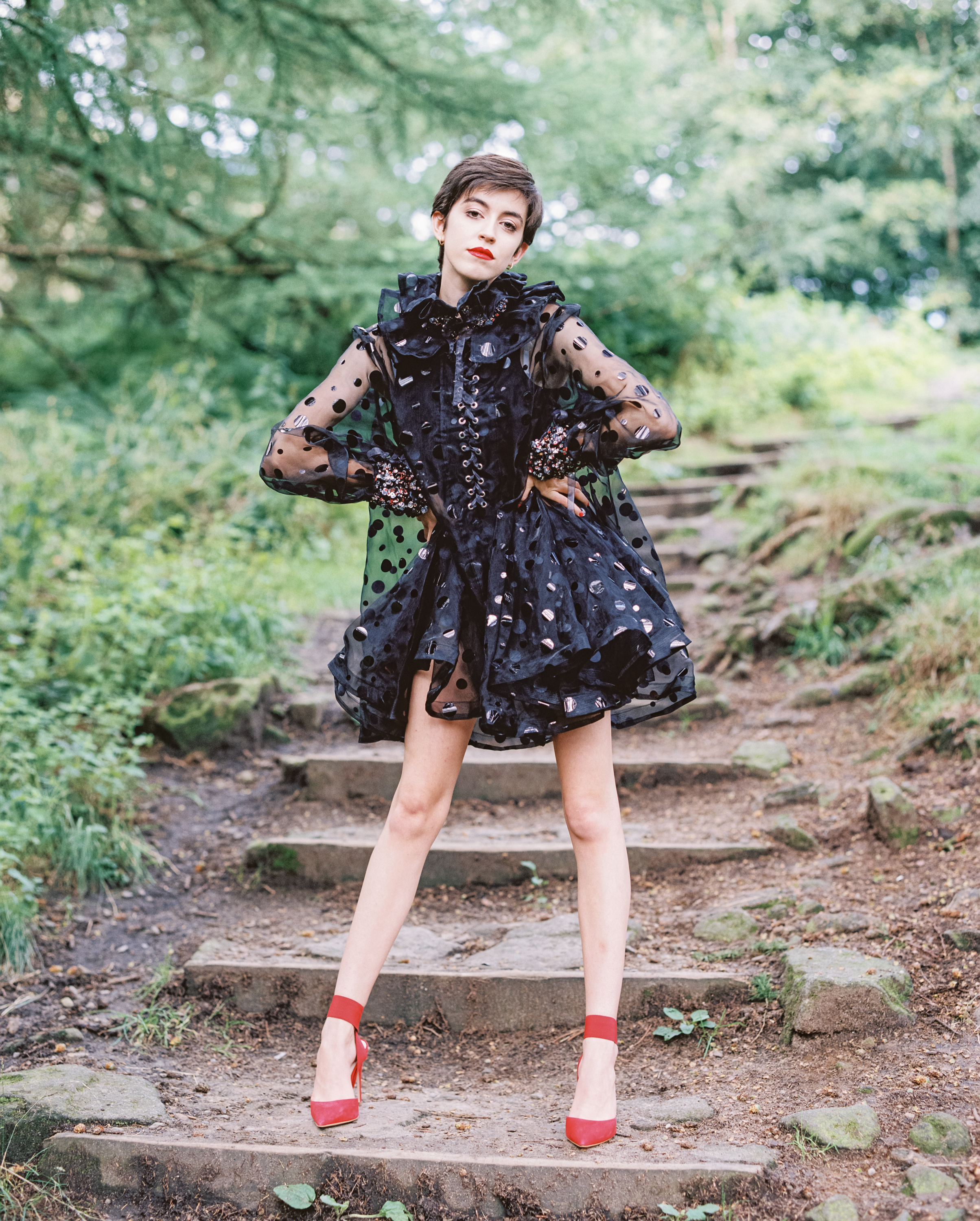
We managed to shoot 4 different looks over the course of a few hours on a sunny afternoon at Dovestones, I really feel like these are some of my best images to date and of course a major part of this is down to Chanel and her amazing designs as well as her talent in front of the lens too, Chanel was lots of fun to work with and made my job easy!

Enough talk!! Here’s some of my fave shots…

0-3.jpg
0-6-Edit.jpg
0-7-Edit.jpg
0-7-Edit-2.jpg
0-8-Edit.jpg
0-8.jpg
0-18-Edit.jpg

So there we go! We got so many great shots together!! I really enjoyed this shoot and loved working with Chanel and her amazing designs. On the technical side of things once again Portra 400 has proven itself to be utterly dependable in mixed lighting situations and every time it renders beautiful tones, contrast and colours - for this shoot I rated it all at 400. Also once again Kodak Pro Image is proving to be another wonderful addition to the line up and some of my fave 35mm shots were from this film :)

The Pentax 67 continues to astound me with the image quality it’s capable of and it’s just so flipping enjoyable to shoot with - here’s to many more creative collaborations to come!

Kodak Pro image 100 & Portra 160 review - Portrait shoot out

Now that I have FINALLY settled on some camera kit that I’ll be keeping around for the long term I can focus my energies on exploring different film stocks - not that I wasn’t doing that anyway but I was finding flitting from one camera to the next a bit of a distraction, for the record the cameras which have won my heart are the Nikon F2 and Pentax 67 - today’s blog features a portrait shoot on the F2 shooting with a shiny new portrait lens and using two different film stocks Kodak Pro Image 100 (a new film to me) and Kodak Portra 160 (a film I have used a few times before)

Whilst the main focus of the conversation will be on looking at the two film stocks first up I’ll take a moment to show you the kit I used on this shoot, I’ll then take you through the shoot itself.

IMG_2740(1).JPG

I have just bought the very wonderful Nikkor 105mm 2.5 a lens which has a HUGE reputation as an amazing portrait lens, when i bought it the focus ring was quite stiff so I sent it off for repair to a chap called Miles Whitehead who did a great job of fixing it and it now has silky smooth focus action - I would highly recomment Miles if you have some camera kit in need of some TLC check his site out HERE. In fact as I write this I am reminded that Miles also serviced my F2 when I bought it so double thanks!! :)

I was originally going to include a few thoughts on the 105mm lens in todays blog but I loved using it so much that I think I’ll reserve that for a dedicated blog all of it’s own - suffice it to say that it’s reputation is very well earned, an amazing piece of glass!

Ideal for portrait, weddings and social events dontcha know…..

Ideal for portrait, weddings and social events dontcha know…..

I think most people will be familiar with Kodak Portra 160 which is a mainstay of Kodak’s professional line up, but what’s this Pro Image 100 all about? I’ve been shooting a lot of Portra 400 and 160 recently and whilst I love both film stocks I am always interested in trying new things and the results I’d seen from Pro Image appealed to me - the other great thing about Pro Image is the price! I got this for £25.95 for 5 rolls!

This film stock has only recently come to the UK/European market - despite being around since the mid 90’s, the stock was only sold in warmer climates, big thanks to the good folks at Nik & Trick for being instrumental in making the case to Kodak for getting this film available in Europe :)

Ok so I have a lovely film camera - check, a great portrait lens - check, a shiny new colour film - check, a beautiful location to shoot in….check! What’s next? I need someone to photograph! Fortunately I’m part of a great facebook group for photographers and models to network and arrange shoots - Danni is someone I met through this group and we’ve shot together before when i was testing out my Pentax 645, you can see those images HERE.

Also worth mentioning at this point that i had my films processed and scanned by the good folks at Exposure Film Lab who I must thank again for their brilliant work, I use them for all my colour films these days because I just love the results I get from them - check them out HERE

The vibe for this shoot was a really natural summer look to make the most of the bright sunshine, we had a beautiful location filled with light, flowers, tall grass and trees - let’s GO!

First up i loaded Kodak Pro Image 100…

0-14.jpg
0-17.jpg
0-10.jpg
0-3.jpg
0-16.jpg
0-26.jpg

Ok then at this stage in the proceedings the word at the forefront in my mind is wow! Danni is a very talented Model which makes my job much easier and the Pro Image film is just lovely :) Let’s move on to the Portra 160 which I loaded up next and we’ll do a bit of a comparsion at the end, here’s the Portra shots…

0-16.jpg
0-14.jpg
0-12.jpg
0-23.jpg
0-7.jpg
0-4.jpg

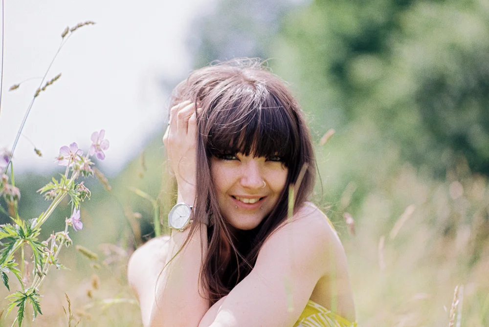
The entire shoot lasted about an hour (if that) we went for a stroll through some lovely scenery and together we created some properly beautiful portraits full of light and life! Danni is a great model she did a brilliant job on this shoot, she puts lots of character into her work and is just a natural in front of camera, this really shines through the images - we’ve worked together before which I think always helps so we’re relaxed and comfortable working together and meant we were able to just get right into it and enjoy the shoot. I’m over the moon with the photos we created together - thank you Danni :) Check out her portfolio HERE.

In summary then both film stocks are clearly capable of wonderfully sharp, textured images with great skin tones, colour balance, contrast and detail - I therefore love them both! They each have their own look so whilst they’re comparable I think there are some differences to take into consideration. This was never intended as a ‘one film versus the other’ contest in which we have a winner and a loser but rather an opportunity to look at how these two film stocks worked under the same conditions - to that end I simply invite you to make your own mind up which you like best - or maybe like me, you like them both?!

Here’s a few of my thoughts on each stock:

Pro Image 100 - it has a wonderful grain structure, punchy contrast and I love how it handles the greens and yellows, shadows perhaps not holding as much detail as portra, it has a classic film ‘look’

Portra 160 - minimal grain as you’d expect from portra, slightly muted colour palette although in these images it produced stronger contrast than I’d expected, Portra definitely holds on to more shadow detail and also perhaps slightly sharper.

What does all this show us then? Well they’re very close actually, much closer than I’d have thought! One aspect which does create an opportunity for comparison is the price with a five pack of Portra 160 retailing at around £35.99 and a five pack of Pro Image around £25.95 then clearly if budget is the deal breaker then Pro Image is your winner, if you absolutely must squeeze every bit of detail out of the shot then perhaps Portra is the one to choose - ultimately we’re all winners here as we in the UK now have access to the lovely Pro Image and I’ve got 4 more rolls sat waiting to go! I can’t wait to shoot it again.


Portraits on film - Night shoot with Cinestill 800T and Lomography 800 Colour

Sharing details of another portrait shoot, this is part of a major ongoing series I’ll be working on as a I rebuild my portfolio - it gives me an opportunity to share some insights on the cameras/films I’m using, the story behind the shoot itself as well as a place to share those photos which might not make it into my main portfolio.

IMG_0884.JPG

Having made the switch to full time film only and also recently adopting the very wonderful Pentax 67 as my main camera I have been keen as mustard to rebuild my portfolio, to explore the creative possibilities (and challenges) that shooting with film offers and basically have a shed load of fun along the way :) To that end I have been seeking out opportunities to collaborate with some of the very creative souls I am fortunate enough to know - hence this series of blogs! :)

This shoot was for my mate Paul who is a Music Producer under the pseudonym ‘Gamma Prime’ he’s been working on some new material and wanted a set of publicity images to help promote the new work.

The idea was to shoot at night and make use of available artificial lighting to add some creativity to the portraits, this assignment called for some special film stocks - Cinestill 800T and Lomography 800 and I also used a roll of Kodak Portra 400 too. I’ll give you a bit of an overview of these film stocks along the way and some thoughts on their particular qualities in use. I hadn’t used either the Cinestill of Lomo films before so I was excited to try them out - Cinestill is an expensive option and Lomo is more of a budget offering so we’ll see how they stacked up against each other.

First thing to consider when shooting in low light/night time is to take account of sunset! Golden hour light is there for the taking either side of the actual sunset so before I broke out the Cinestill and Lomo films I used a roll of Kodak Portra 400 to snag some of that golden hour light.

Kodak Portra 400

0-4.jpg
0-10.jpg

Shooting with the Pentax 67 you only get 10 frames per roll of film so you really have to make each frame count! As the light fell I loaded the roll of Lomography 800 and since we were still in golden hour I used the first few frames here. At this point it’s worth stating that in a stand up contest Portra 400 vs Lomo 800 there’s really not a huge amount in it, they’re both great films although I think Portra has the edge - crisp grain structure as you’d expect from portra and shadows hold up well with lots of detail. That being said the Lomo film is no slouch and it has a very definite character and feel all it’s own.

Lomography 800

0-2-2.jpg
0-4-2.jpg

We drove into town for the night shots and took a walk through the University Campus to take advantage of the artificial lighting and interesting architectural features. These first couple of frames are still on Lomo 800 and I really like how they came out - a very definite grain charachter which I like very much, shadows don’t hang on to too much detail but in this artificial lighting I think it adds to the effect.

Lomography 800

0-6.jpg
0-2-4.jpg

The images below are all shot on Cinestill 800T - this film stock is repackaged motion picture film, the stuff they use to make Hollywood movies! I was very excited to try it out and it did not dissapoint! the letter ‘T’ in it’s name designates that it’s a Tungsten balanced film so it was designed to be shot under artificial lighting - as you can see the tonality and detail are really great here.

Cinestill 800T

0-2-3.jpg
Note my iphone acting as a fill light here! Focussing was getting a little difficult as it got darker so this helped - I’m thinking of getting a little LED light to help in future

Note my iphone acting as a fill light here! Focussing was getting a little difficult as it got darker so this helped - I’m thinking of getting a little LED light to help in future

0-4-3.jpg
0-8-2.jpg

Cinestill 800T has been processed to remove the Anti Halation layer which in some conditions gives lighting a strange glow, it also appears quite prone to light leaks as you can see on the left side of the above image - although in this case I kind of like the effect!

This shoot was planned as a portrait shoot for a friend to create some promotional images for his work as a Music Prodcuer - you can check out Paul’s music HERE :)

I hadn’t planned to compare and contrast these film stocks but the differences between the final images and the way I shot them presented the opportunity to reflect on the different charachters of each stock, overall I like all of these films and very happy with how they came out - here’s my thoughts on each in turn:

Portra 400 - what is there to say about this film which hasn’t been said already? It’s a classic for a reason and is one of my firm faves - clean grain, great details and rich colours. I’m tempted to explore how flexible this film stock is maybe pushing it to 800 and beyond in lower light to see how it coped. Portra is my go to film, a quality product capable of wonderful results.

Lomo 800 - this was a bit of a wildcard choice and it’s a very solid performer, espeically when you consider the price for a pack of three rolls of 120 is about £18. I shot it in good light and in low light in both situations it doesn’t hold up shadow detail as well as the other two stocks but this shouldn’t put you off, the grain structure is more prominent than either Kodak or Cinestill but this is also not bad news - it gives the film a look all it’s own which is good.

Cinestill 800T - this film blows me away - I love the colours, contrast and tones but more importantly for these shots it’s how the film handles shadows with details holding up really clearly even in very low light, it’s expensive stuff that’s for sure but it’s definitely worth a shot in the right conditions. It’s proneness to light leaking could be annoying if you have ‘THE’ killer shot and some random leaks could spoil your hard work - on the other hand it could just add something to the image!

It’s worth stating at this point that I was really pleased with how the Pentax 67 worked on this shoot, I was able to achieve useable images down to 1/30 of a second in low light which pleases me very much! The 105mm 2.4 lens continues to impress me with it’s ability to create 3D like images with pristime sharpness and beautiful bokeh too.

I have some more creative portrait shoots lining up over the next few months so I’ll be continuing the portraits shot on film series and looking forward to exploring more wonderful film stocks!

Shooting 35mm film in the studio

Using film in the studio is a really enjoyable experience, I was fortunate to be asked to second shoot my friend and fellow Photographer Ruth's fashion shoot in her studio a while back and had the opportunity to grab a few shots of very awesome model, Zivvy. All of the black and white shots were taken on Fuji Acros 100 film on a Canon EOS 3 camera, all the colour images on a Canon 6D DSLR.

img267-edit1-Edit.jpg

I love working in the studio - it's a real treat, most of the time I shoot on location which requires some flexibility in your approach to allow for all sorts of variables in lighting and the general randomness that comes from shooting on location (although that is part of the fun)! However in the studio YOU are in full control!  In these images there are three studio strobes - one either side and another overhead, with a fourth light providing a backlight to the white background so there's a lot to take into consideration, it's an exercise in balancing and shaping light to achieve a certain effect depending on the look you're trying to achieve. I take no credit for coming up with the concept or the lighting arrangements for this shoot - that was all Ruth!

img272-edit.jpg

It can take a while to get your lighting and composition worked out even when using a digital camera with the benefit of being able to instantly review  your shot, the process becomes slightly more protracted when using film, which is why I recommend using a combined approach - shoot film AND digital!

Back in the day photographers would often use a polaroid camera (or back for their medium format camera) to assess how the light was falling on their subject, polaroid is still available but it's expensive stuff, you can also get flash meters but they're not cheap either so I used my Canon 6D DSLR to meter the shots and judge the lighting - think of it as a digital polaroid! :)

Zivvy, Gav and Ruth reviewing the mood board and deciding on final styling

Zivvy, Gav and Ruth reviewing the mood board and deciding on final styling

As second shooter I took some behind the scenes photos on my 6D as Ruth, Zivvy and Gav the Hair Stylist did their thing - I really enjoy shooting candid, reportage images like this as it shows the hard work that goes in to making the final images - it's normal to spend a long time getting ready for even a simple shot and it's all part of the creative process that often gets missed out, behind the scenes shooting allows you to tell that story.

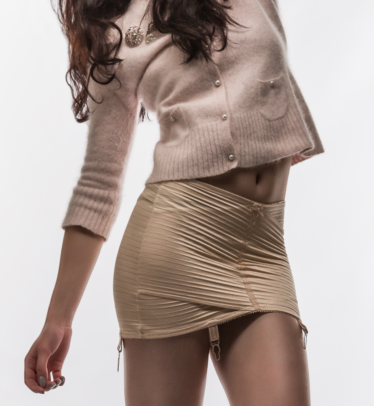
Zivvy trying out some vintage bling

Zivvy trying out some vintage bling

The key to a successful model shoot is not lighting, or kit it's....wait for it.... team work! Your ability to communicate, collaborate and ultimately create with the stylist, model, hair and make up artist is fundamental, I was fortunate in that Ruth had put together a great team and concept (and also put her make up skills to good use), Zivvy is a very talented model and the hair stylist Gav was also awesome, having a good team of people working together towards a shared goal is much more important that a whizzbang camera or lens or whatever (although of course they're nice to have too) ;)

IMG_6701.jpg
IMG_6728.jpg
IMG_6762.jpg

In order to integrate my digital and film sets ups when working in the studio I used a Canon EOS3 which has exactly the same mounts, inputs as the 6D so i could use the same lenses and flash triggers switching between film and digital as required, nice and simple it's no good spending ages faffing about trying to get ancient film gear to talk to modern studio lighting whilst the model, Hair and MUA, stylist et al are waiting for me to figure it all out, I like to shoot quickly and keep the energy going as I think this translates to the final images so having a fully integrated set up is a real bonus.

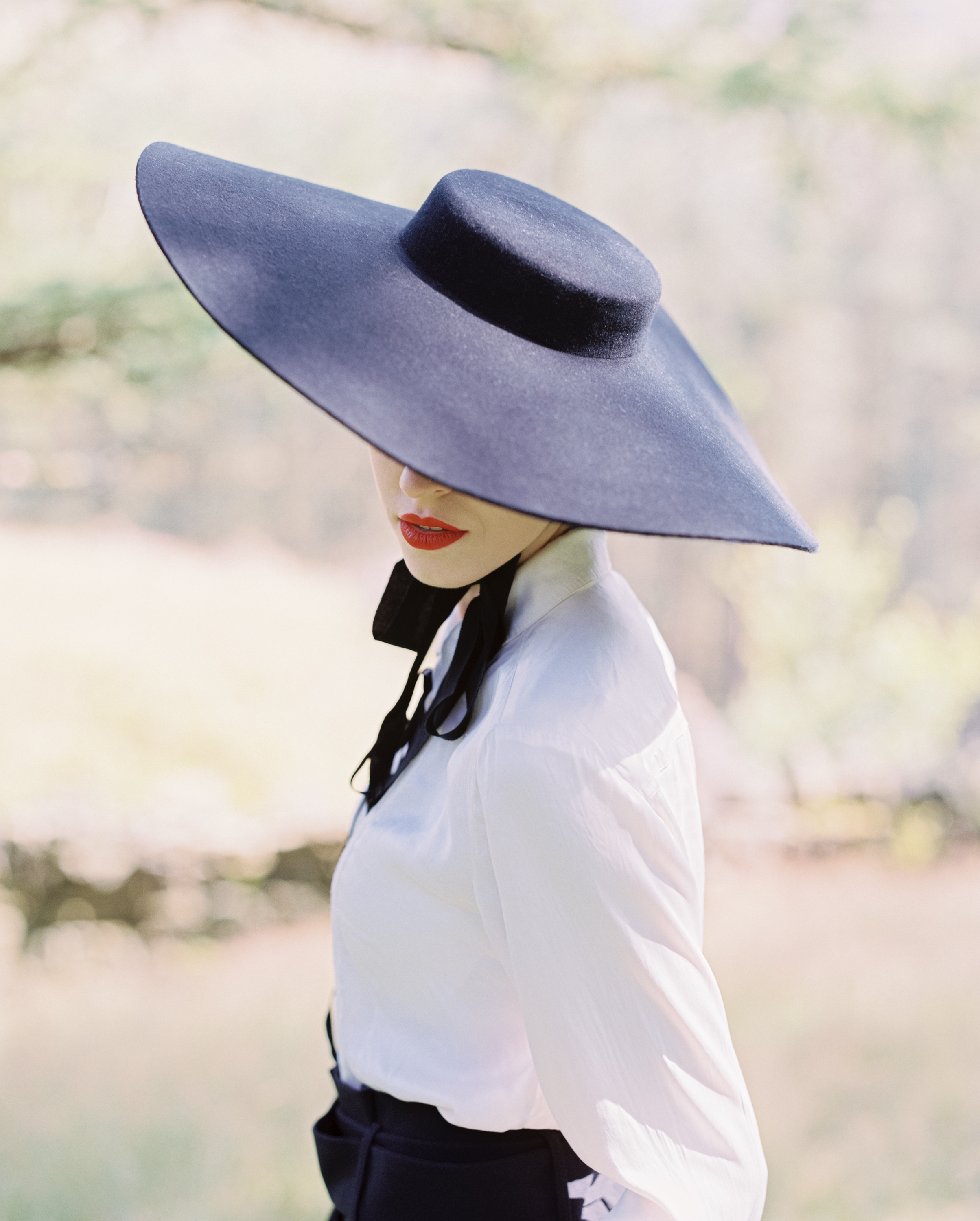
All of the black and white images you see here are Fuji Acros 100 35mm film which I semi stand developed myself in Adonal (on reflection probably not the best developer/process for the job as it's known to bring out the grain of the film and Acros is renowned for being smooth - next time I'll use something else)! I love the high contrast though!
img272-edit.jpg
img252.jpg
img287.jpg
img278.jpg

After the shoot I had a couple of frames left so I used them up around the studio.....

img277.jpg

Fuji Acros 100 is a lovely film, I kind of wish I'd been more patient and bought some more appropriate developer/used a more appropriate process but I was impatient to see the final images! Don't get me wrong though I love the images and am very happy with them I just think that a developer like Xtol or D76 would've made for a smoother finish perhaps - oh well! live and learn!

img280.jpg

Of course I wasn't just metering with the 6D - I enjoy digital photography very very much also, here are a few of my digital shots...

IMG_6858.jpg
IMG_6960.jpg
IMG_6780-Edit.jpg

So that's it then - I hope you've enjoyed this latest blog post. I'm really looking forward to working with a combination of film and digital cameras in the studio again soon :)